Theme Settings
The Hanami theme’s settings allow you to customize its appearance and functionality to match your brand. You can upload your logo and favicon, adjust their sizes, and select fonts for headings and body text. Colors for key elements like buttons, backgrounds, and text can be customized, along with product card options such as showing vendors, prices, and sale tags. Additional features include enabling an age verifier, configuring a "scroll to top" button, and setting the product image aspect ratio, offering flexibility for a tailored storefront experience.
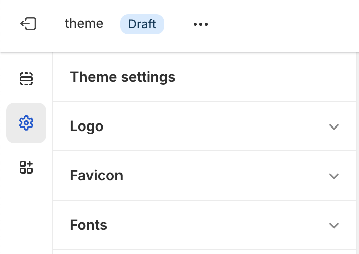
To access theme settings, click the gear icon in the upper left of the customizer screen.
Logo
Configuration
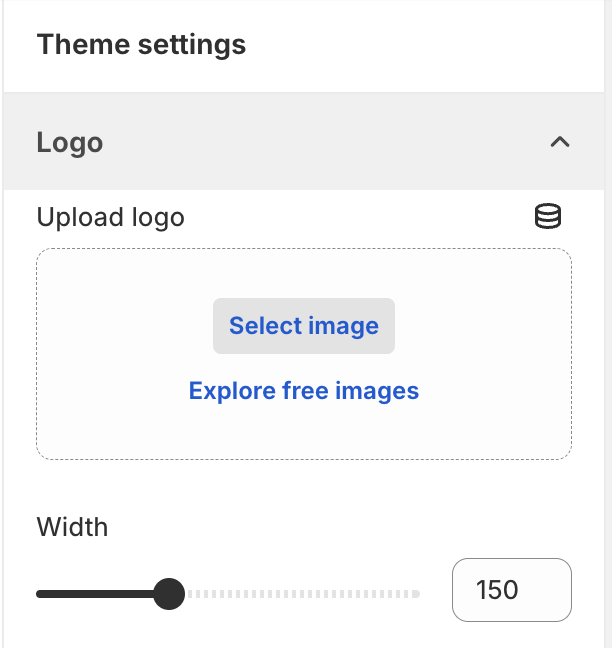
- Upload your logo using the image picker
- Adjust logo width (75px to 300px, in 25px increments)
Tips
- Use a high-quality, transparent PNG or WEBP for best results
Favicon
Configuration
- Upload your favicon using the image picker
- Recommended size: 32x32 pixels
Tips
- Use a square image for best results
- Ensure the favicon is recognizable at small sizes
Font
Configuration
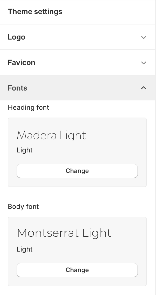
- Choose heading font (default: Madera)
- Select body font (default: Montserrat)
Tips
- Choose a font that complements your brand and content
- Ensure the font is legible and easy to read
Color
Configuration
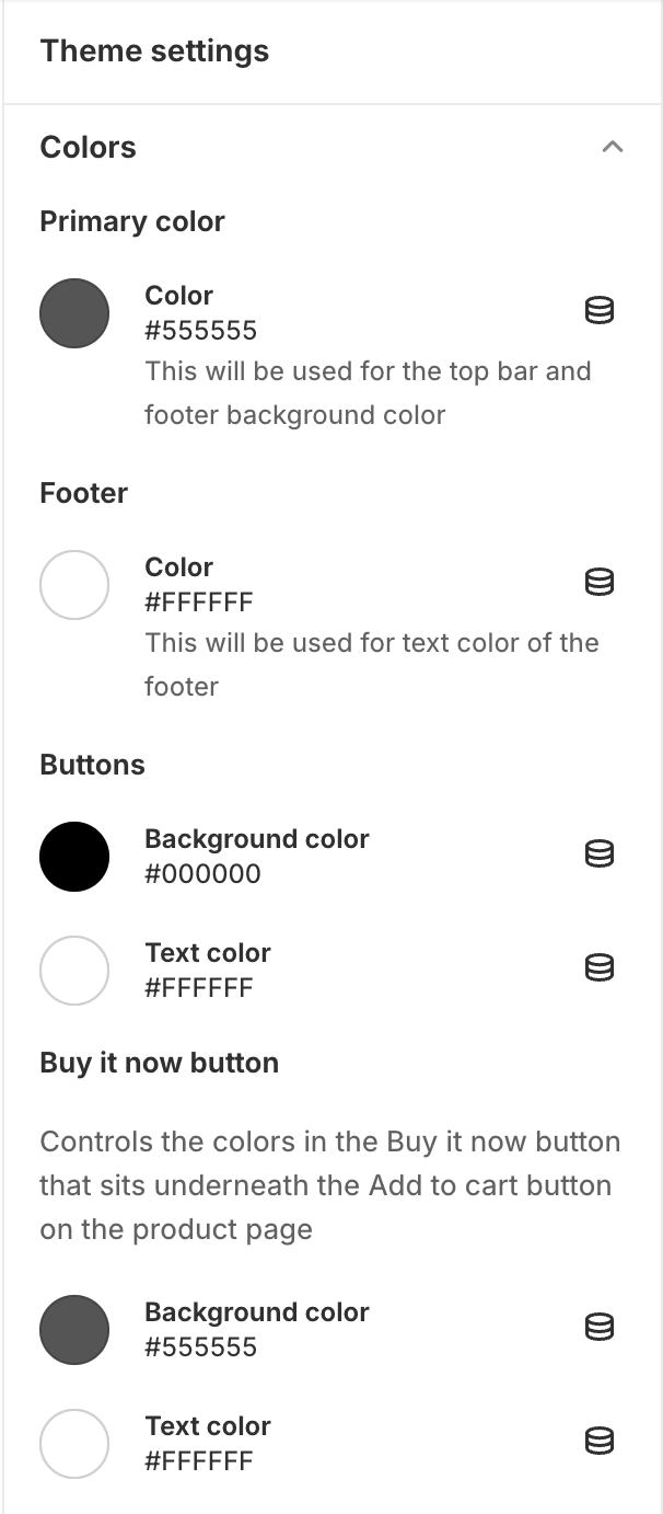
- Primary Color
- Footer Text Color
- Button Colors: Set background and text color
- "Buy It Now" Button Color: Customize colors for this specific button
- Sale Tag Colors: These appear over the product results and next to the price (if on sale) on the product page
Tips
- Some sections have their own button color settings
- Use colors that match your brand identity
- Ensure good contrast for readability
Aspect Ratio
Configuration
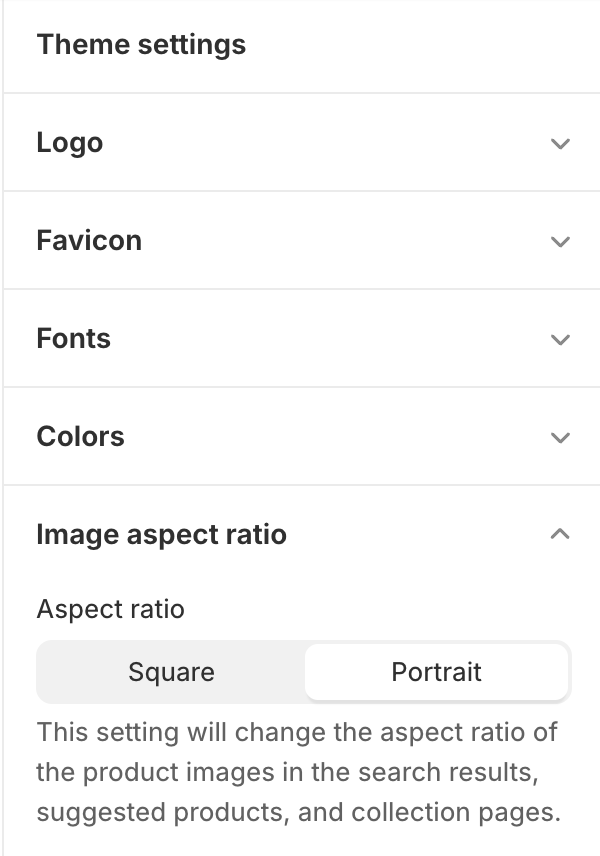
- Choose the aspect ratio for product images in search results, collections, and suggested products.
Tips
- Use the aspect ratio that best fits your products
Age Verifier
Configuration
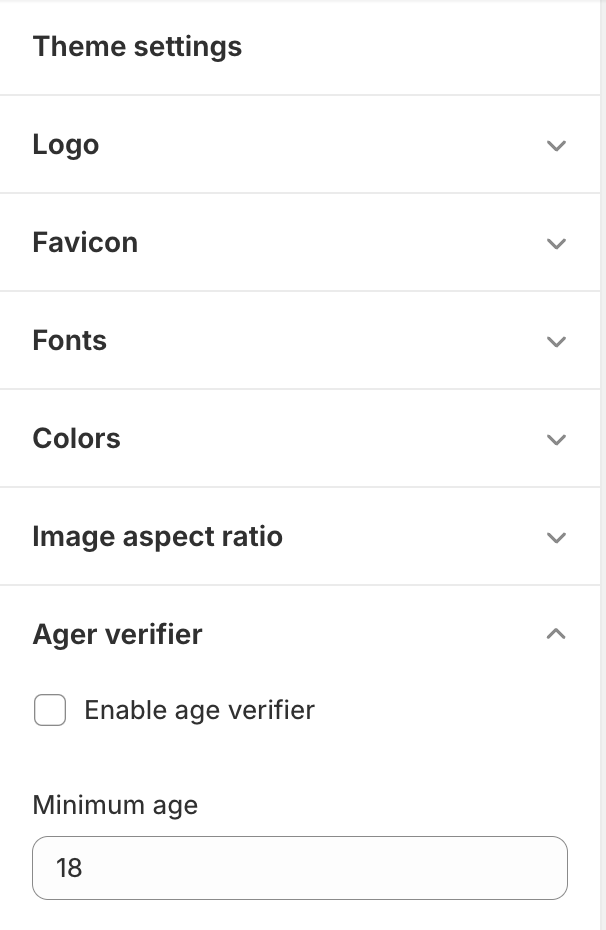
- Enable/disable age verification
- Set minimum age (18-100 years)
Sections
Each section in the Hanami theme, such as the header, slideshow, or featured product, comes with its own customizable settings to adjust its design and functionality. Button colors can be set globally in the theme settings or customized individually within sections. Most sections also include padding top and bottom sliders, allowing you to fine-tune spacing between sections for a balanced layout. These options give you control over the visual hierarchy and overall aesthetics of your store.
Before/After Image Slider
Adding the Section
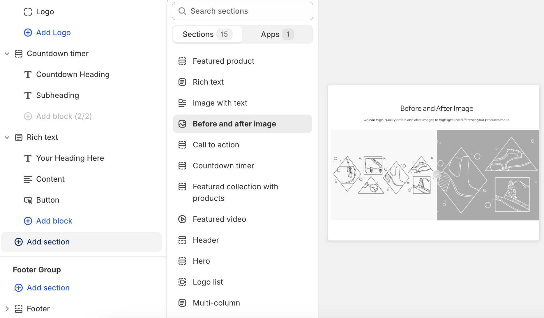
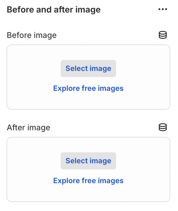
Click "Add section" and select "Before After Image"
Configuration
- Upload "Before" and "After" images
- Select slider orientation: Horizontal or Vertical
Tips
- Use high-quality images
- Ensure both images have the same dimensions
- Choose orientation that best showcases the difference
Call to Action
Adding the Section
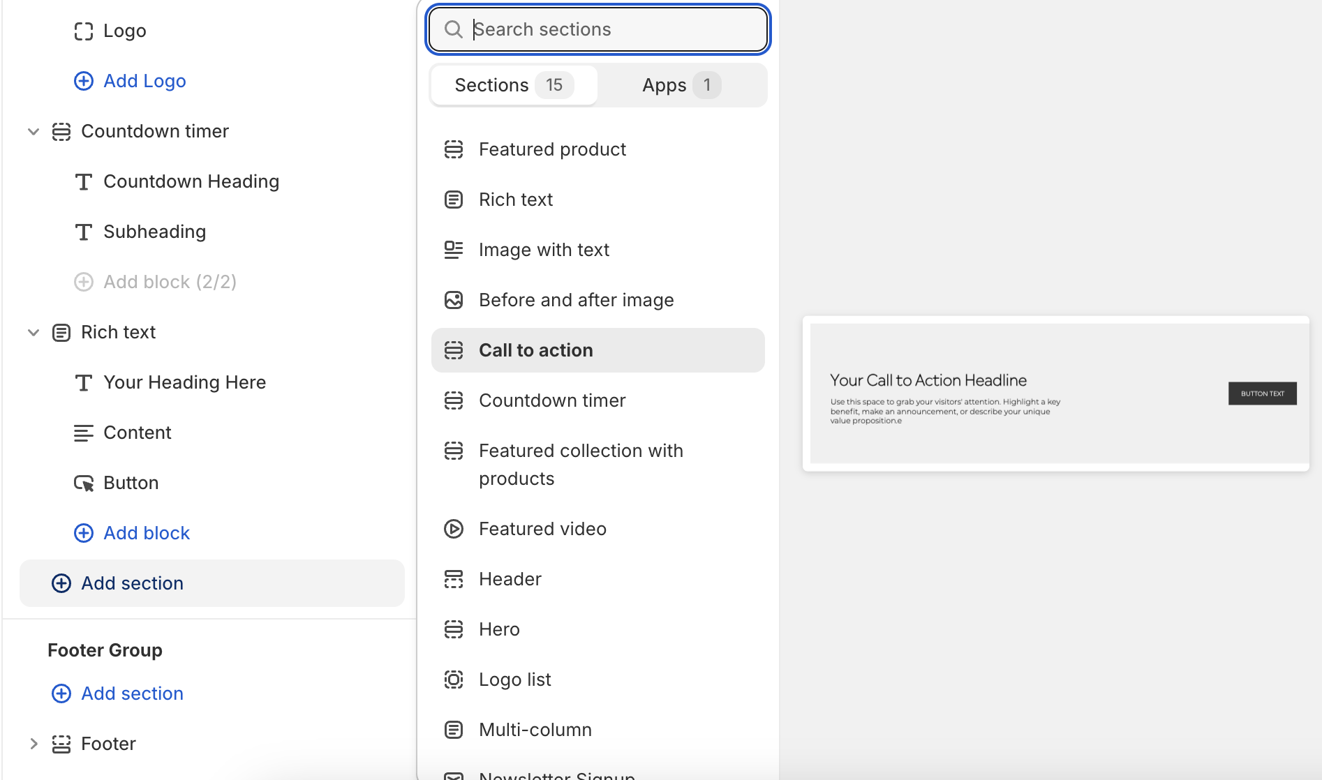
Click "Add section" and select "Call to Action"
Configuration
- Set background color and text color
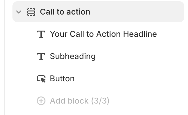
- Add content blocks: Heading, Subheading, and Button
Tips
- Use contrasting colors for better visibility
- Keep your message clear and concise
- Ensure the button link leads to a relevant page
Countdown Timer
Adding the Section
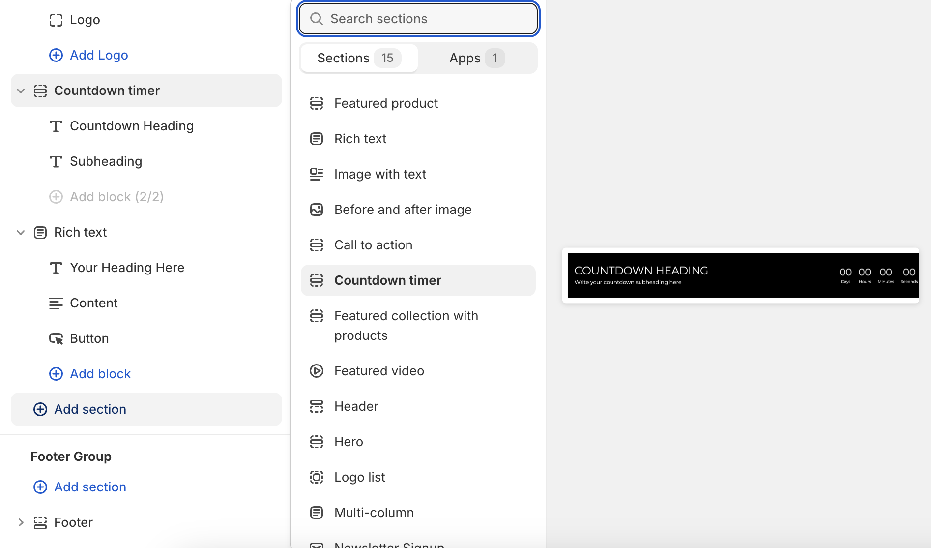
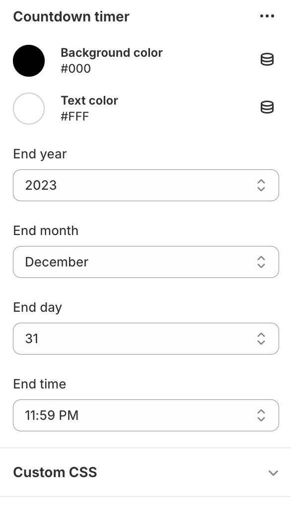
Click "Add section" and select "Countdown Timer"
Configuration
- Set background color and text color
- Choose end date: year, month, day, and time
Tips
- Use contrasting colors for better visibility
- Set an end date in the future to ensure the timer is active
- Keep heading and subheading concise for better impact
Custom Liquid
Adding the Section
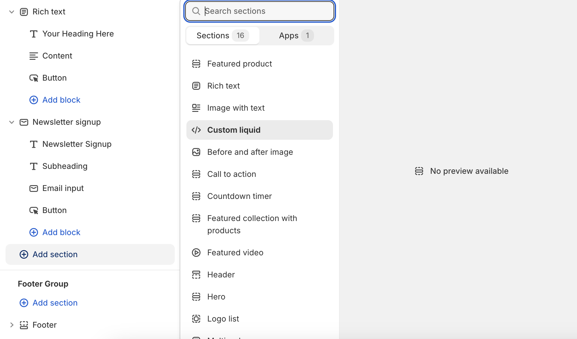
Click "Add section" and select "Custom Liquid"
Configuration
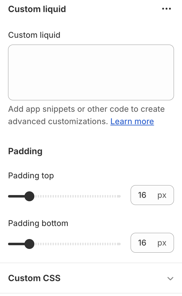
- Enter your custom Liquid code in the provided text area
- Adjust padding settings:
- Set top padding (0-100px, in 4px increments)
- Set bottom padding (0-100px, in 4px increments)
Usage
- Use this section to add custom Liquid code to your theme
- Ideal for advanced customizations or integrations
Tips
- Ensure your Liquid code is valid to avoid errors
- Use padding to control spacing around your custom content
- Test thoroughly to ensure compatibility with your theme
Featured Collection With Products
Adding the Section
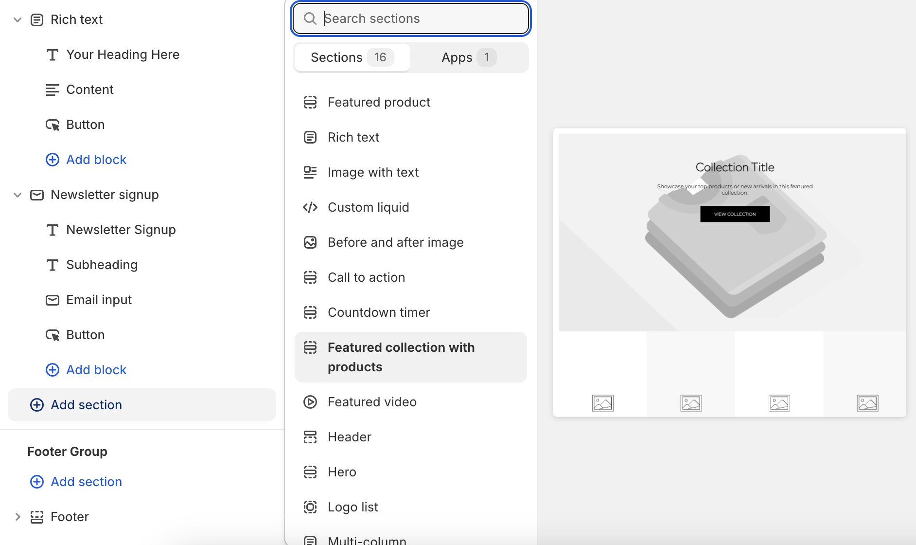
Click "Add section" and select "Featured Collection with Products"
Configuration
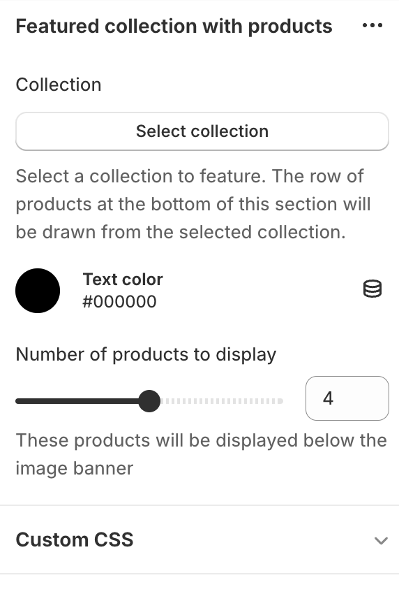
- Select a collection to feature
- Choose text color for banner content
- Set number of products to display (2-6)
Tips
- Ensure selected collection has enough products to display
Featured Collections
Adding the Section
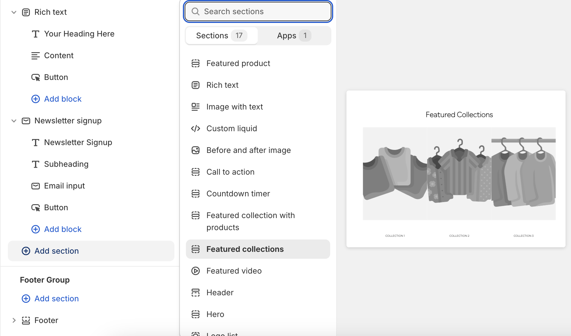
Click "Add section" and select "Featured Collections"
Main Configuration
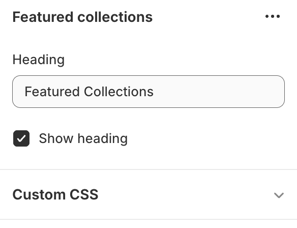
- Set heading text for the section
- Choose whether to display the heading
Adding Collections
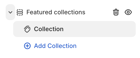
- Click "Add Collection" to create a new block
- Select a collection from your store to feature
- Repeat for each collection you want to display
Tips
- Use high-quality images for each collection
- Choose collections that represent your store's range
Featured Product
Adding the Section
Click "Add section" and select "Featured Product"
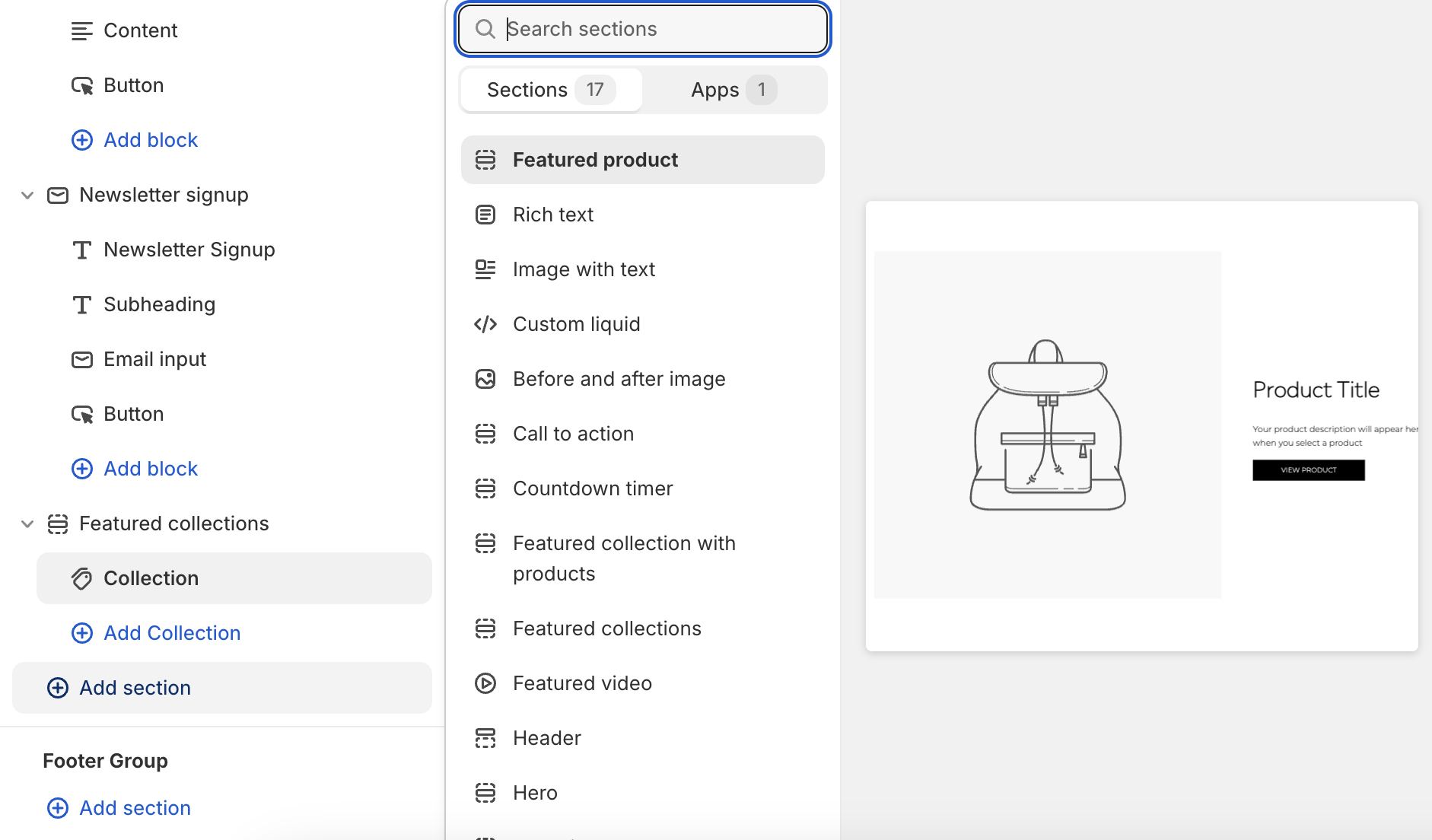
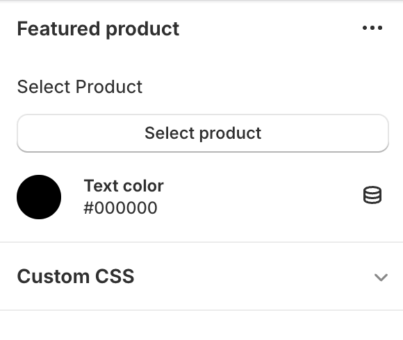
Main Configuration
- Select a product to feature
- Choose text color for product details
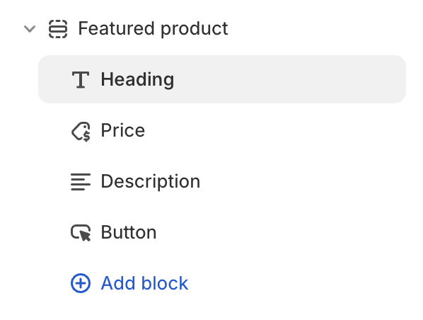
Content Blocks
- Heading: Displays product title
- Price: Shows product price
- Content: Presents product description (truncated to 500 words)
- Button: Adds a call-to-action button (customizable text)
Tips
- Use high-quality product images
- Write compelling product descriptions
- Regularly update the featured product to showcase different items
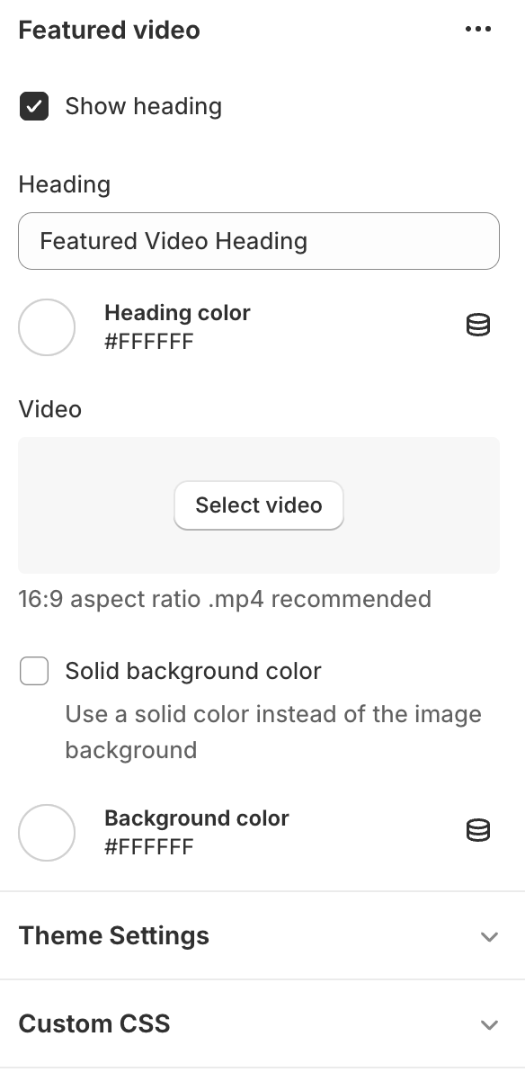
Featured Video
Adding the Section
Click "Add section" and select "Featured Video"
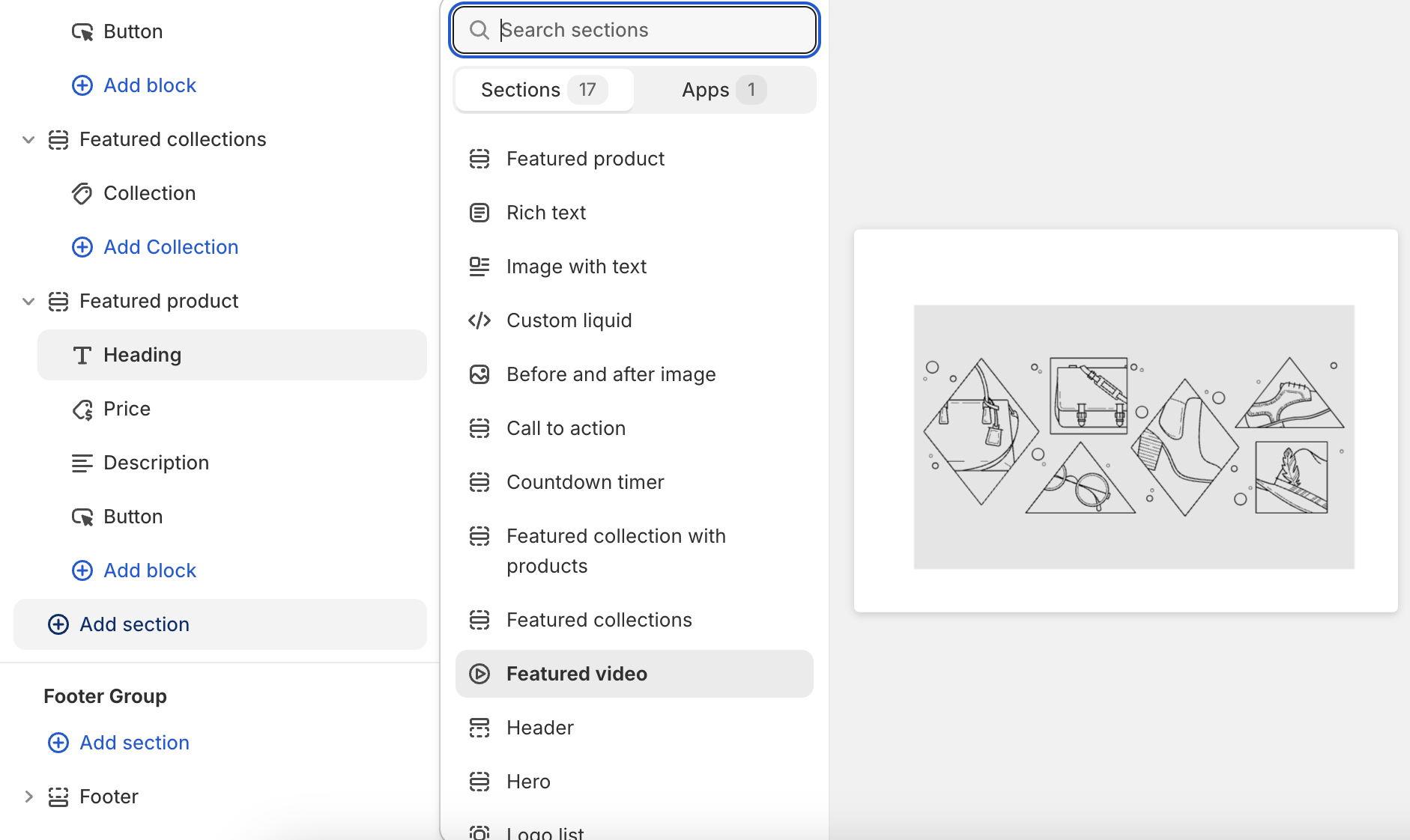
Main Configuration
- Choose whether to show a heading
- Set heading text and color
- Upload or select a video (supports YouTube and Vimeo)
- Option for solid background color
Display Information
- Supports uploaded videos
- Videos play muted, looped, and inline
- Placeholder image displays if no video is selected
Tips
- Use high-quality, engaging video content
- Keep videos short and relevant to your brand or products
- Ensure the heading complements the video content
Header
Adding the Section
The header section is typically pre-installed in your theme
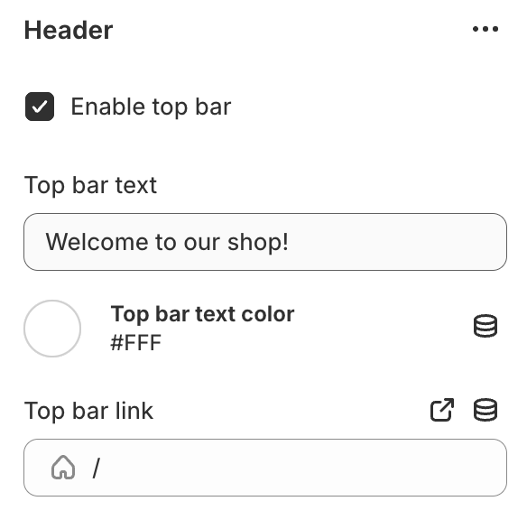
Top Bar Configuration
- The top bar's color is controlled by your theme's primary color
- Enable/disable top bar
- Set top bar text and link
- Choose text color
Main Navigation
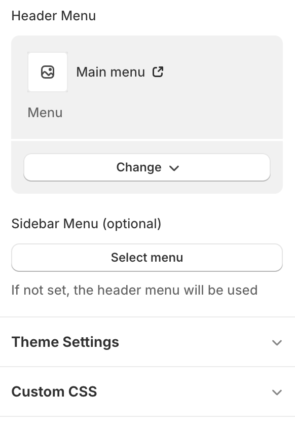
- Select header menu (default: main-menu)
- Option to set a separate sidebar menu
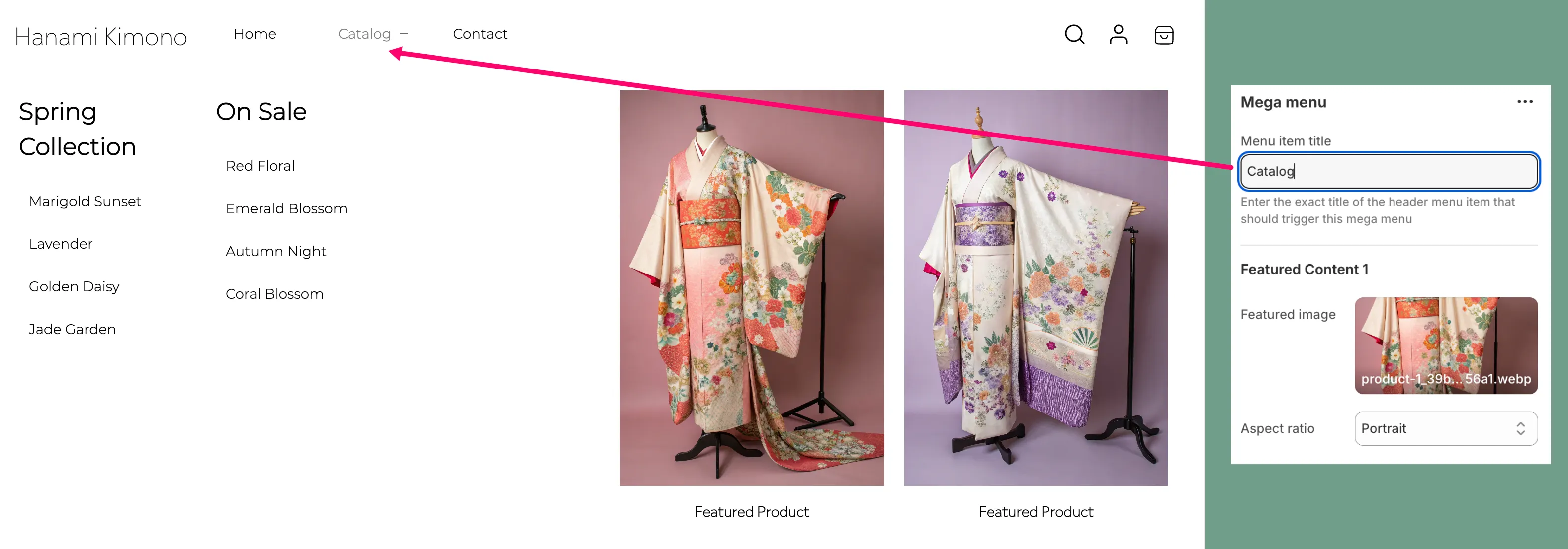
- Supports multi-level menus
Logo Settings
- Upload logo in theme settings
- Adjust logo width
Header Icons
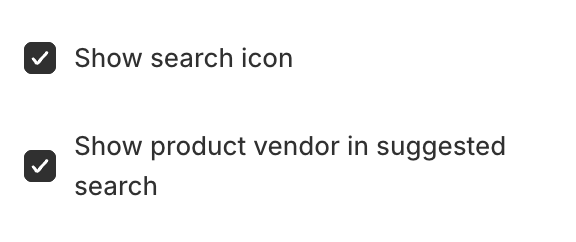
- Search icon (optional)
- Account icon
- Cart icon with item count
Search Functionality
- Overlay search with live results
- Option to show vendor in search results
Mobile Menu
- Hamburger menu for mobile devices
- Sidebar menu with multi-level navigation
Tips
- Keep menu items concise for better navigation
- Use high-quality logo image
Hero
Adding the Section
Click "Add section" and select "Hero"
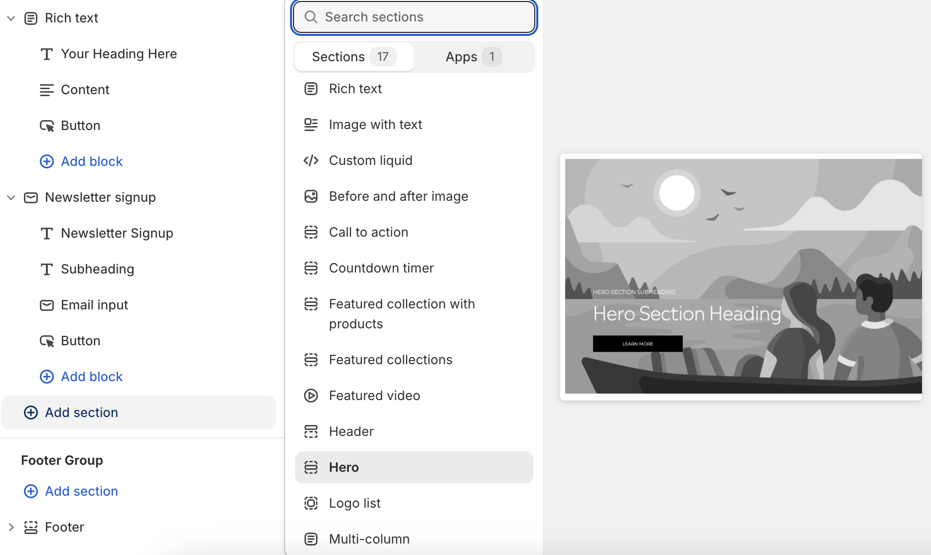
Configuration
- Choose media type: Image or Video
- Upload hero image or video
- Enable/disable zoom effect for images
- Select alignment for content blocks

Tips
- Use high-quality, visually striking images or videos
- Keep text concise for better readability
- Ensure button text clearly communicates the action
Image With Text
Setting Up the Image with Text Section
Adding the Section
Click "Add section" and select "Image with Text"
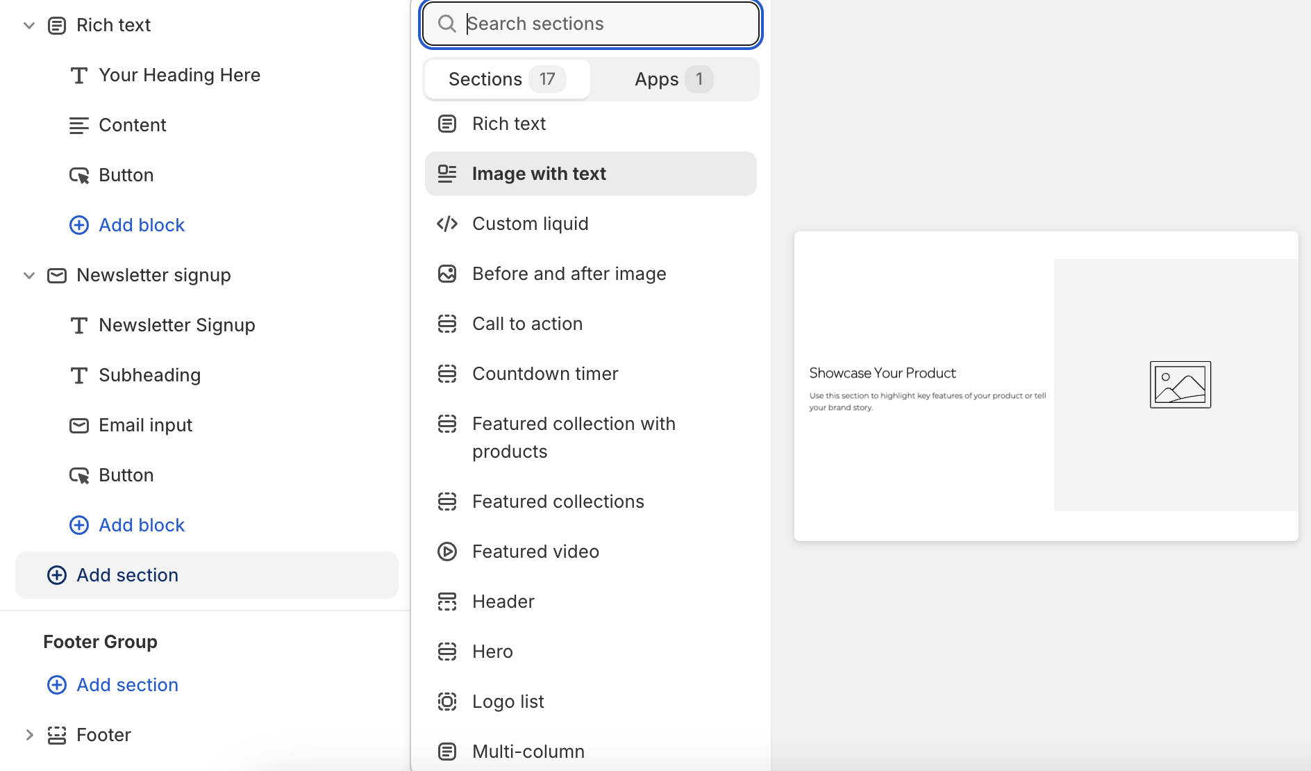
Configuration
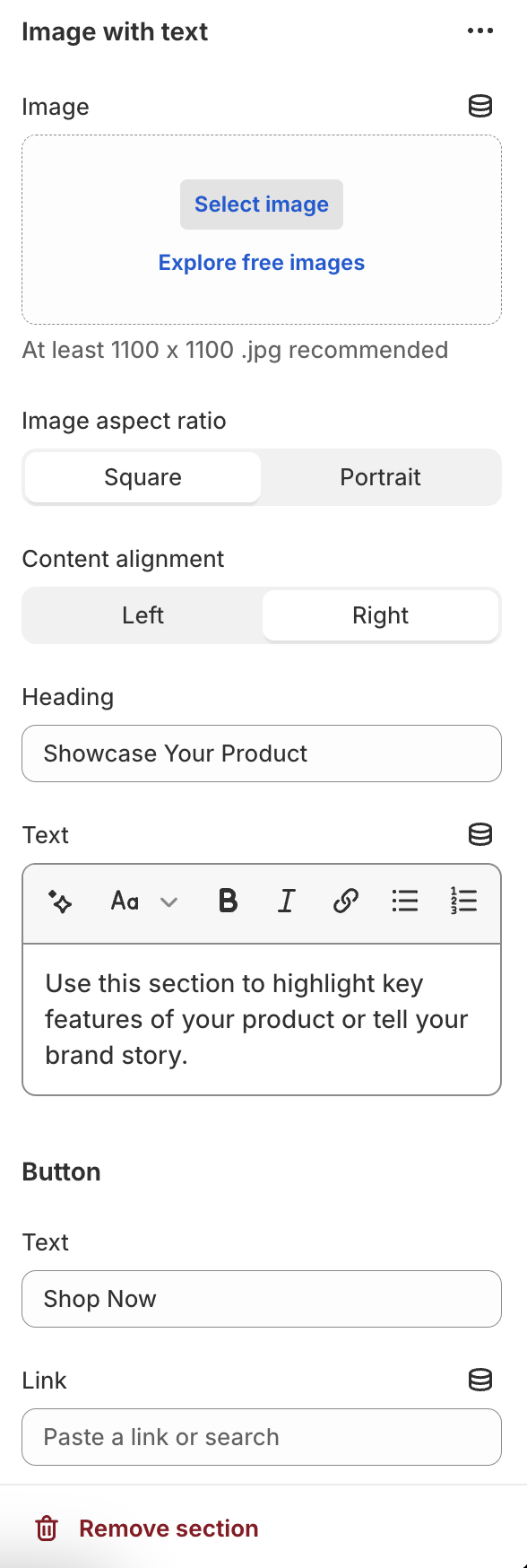
- Upload an image (recommended size: at least 1100x1100px)
- Choose image aspect ratio: Square or Portrait
- Set image alignment: Left or Right
Tips
- Use high-quality, relevant images that complement your text
- Keep heading and text concise for better readability
- Ensure button text clearly communicates the action
Latest Blog Posts
Adding the Section
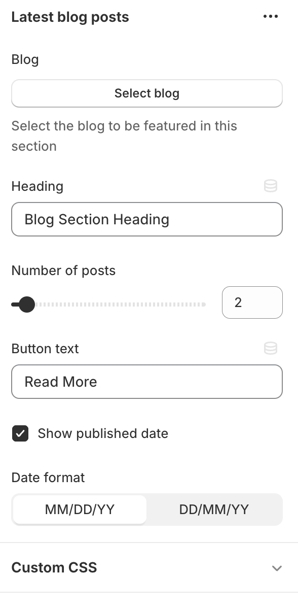
Click "Add section" and select "Latest Blog Posts"
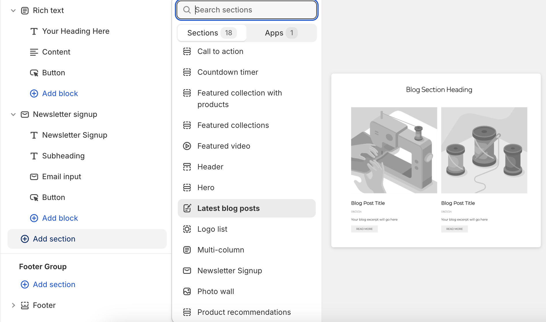
Configuration
- Select the blog to display posts from
- Set a heading for the section
- Choose the number of posts to display (1-24)
- Customize the "Read More" button text
- Toggle display of published date
- Select date format (MM/DD/YY or DD/MM/YY)
Tips
- Use high-quality featured images for blog posts
Logo List
Adding the Section
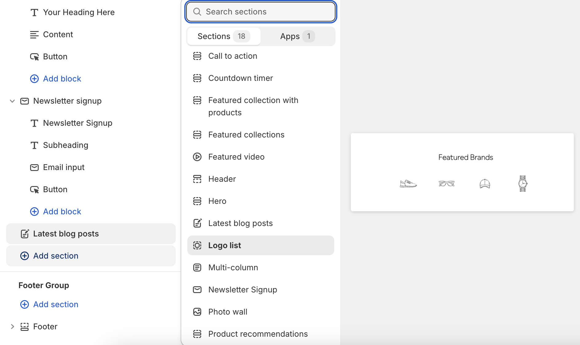
Click "Add section" and select "Logo List"
Section Settings
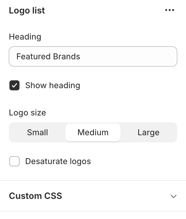
- Set a heading (default: "Featured Brands")
- Choose to show or hide the heading
- Select logo size: Small, Medium, or Large
- Option to display logos in grayscale

Adding Logos
- Click "Add logo" to create a new block
- Upload a logo image
- Optionally, add a link for the logo
- Repeat for each logo (up to 12 maximum)
Tips
- Use consistent logo sizes for a uniform look
- Ensure linked logos lead to relevant pages
Multi-column Content
Adding the Section
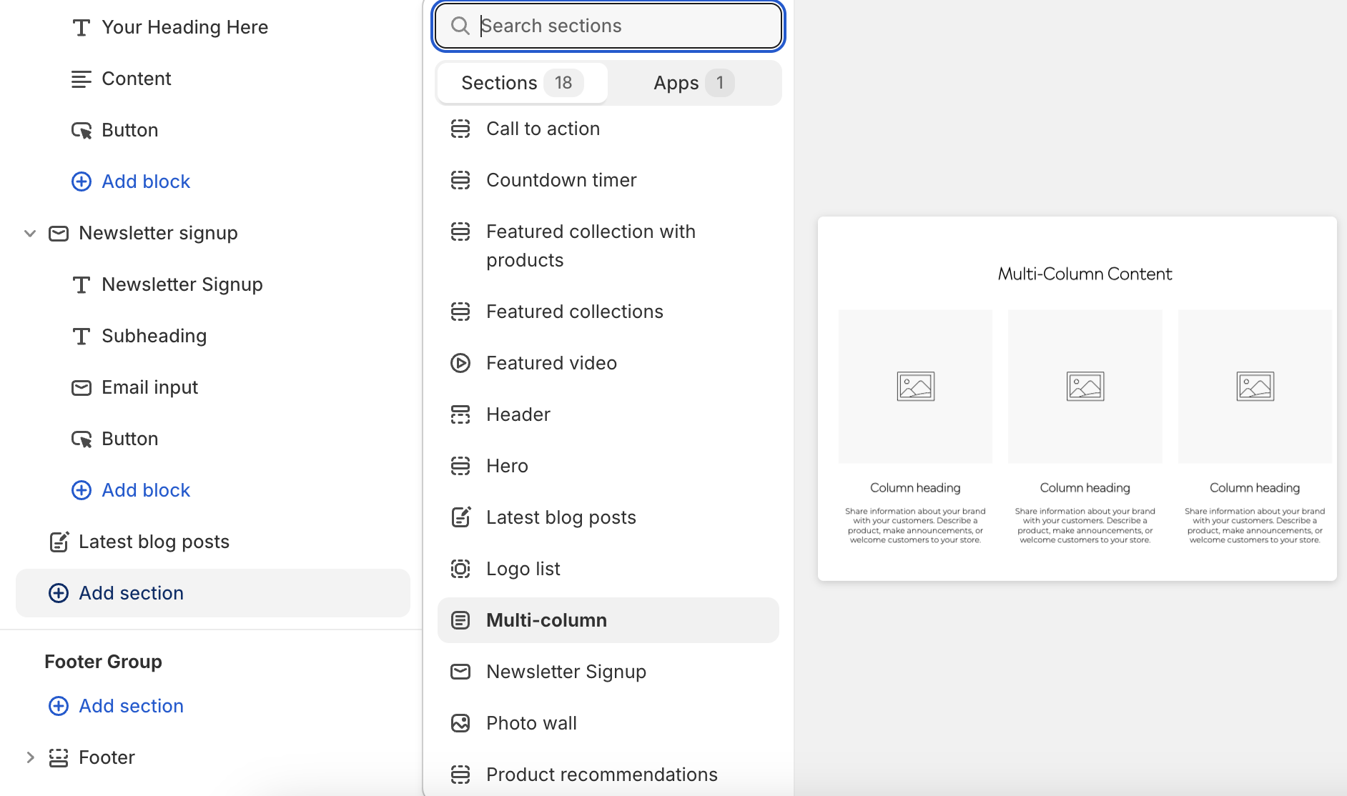
Click "Add section" and select "Multi-Column Content"
Configuration
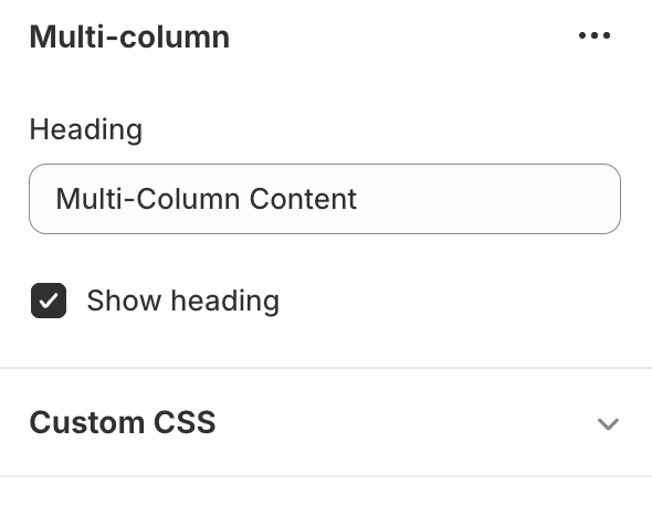
- Set a heading (default: "Multi-Column Content")
- Choose to show or hide the heading
Adding Columns
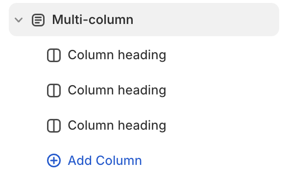
- Click "Add column" to create a new block
- For each column, you can:
- Upload an image
- Set a column heading
- Add rich text content
- Add as many columns as needed
Tips
- Use consistent image sizes across columns for a uniform look
- Keep column headings concise for better readability
- Use the rich text editor to format column content effectively
Photo Wall
Adding the Section
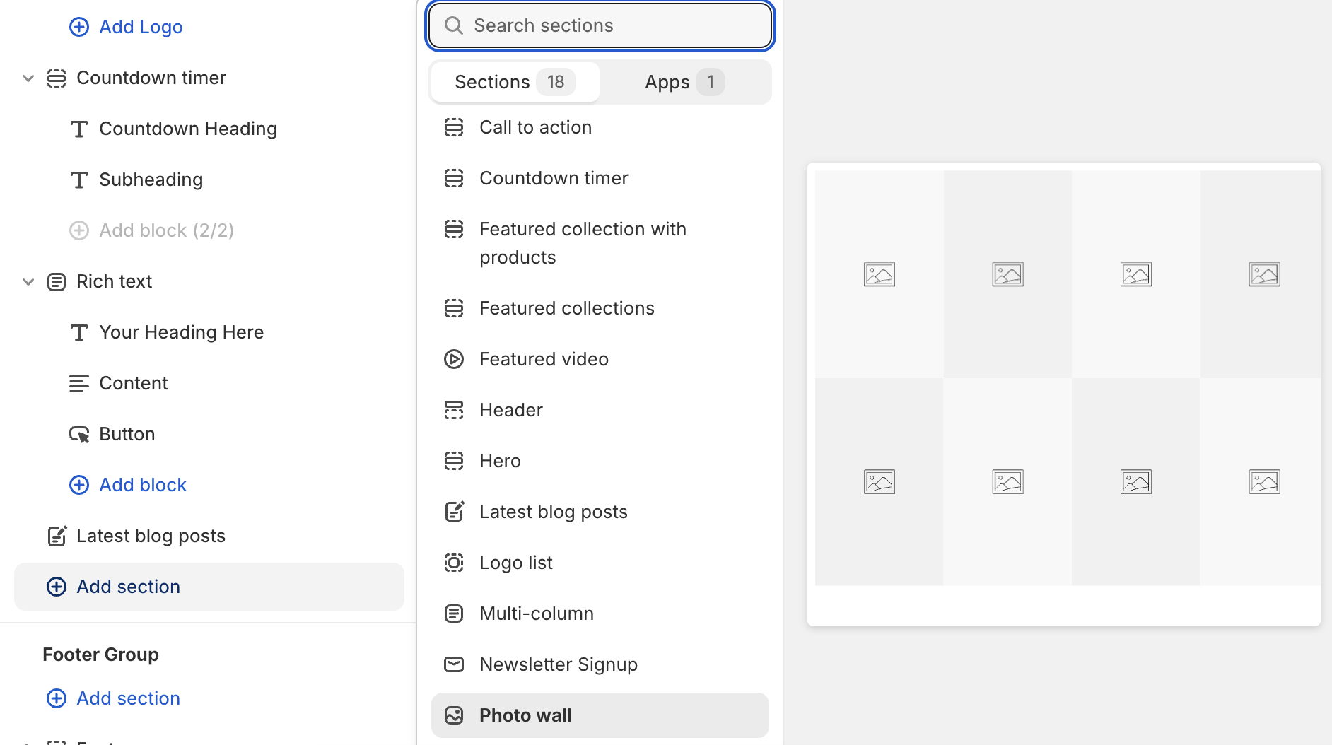
Click "Add section" and select "Photo Wall"
Adding Images
- Click "Add image" to create a new block
- For each image, you can:
- Upload an image
- Add an optional link
- Choose to show or hide the label that appears on hover
- Set label text and color
- Add as many images as needed
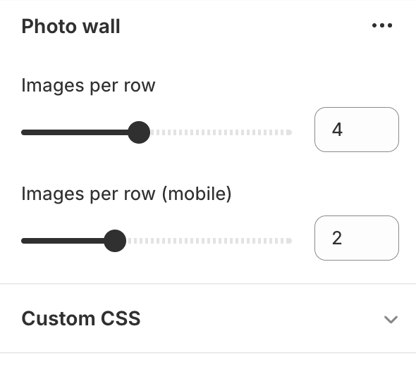
- Select the amount of images per row
Tips
- Use consistent image sizes for a uniform look
- Consider using links to create clickable images
- Experiment with different numbers of images per row for various layouts
- Use labels to provide context or calls-to-action for images
Rich Text
Adding the Section
Click "Add section" and select "Rich Text"
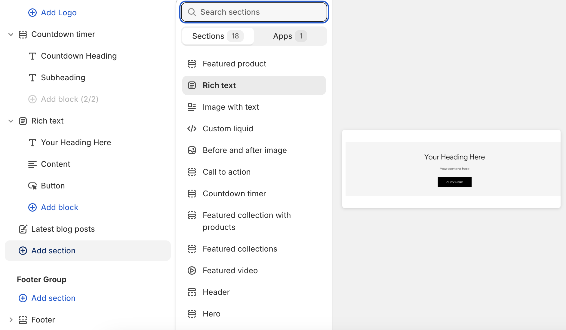
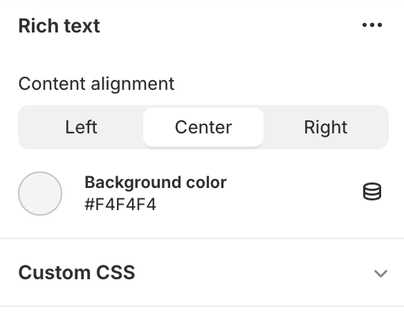
Section Settings
- Choose content alignment: Left, Center, or Right
- Set background color
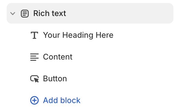
Adding Content Blocks
- Heading:
- Toggle visibility
- Set heading text
- Text:
- Add and format content using rich text editor
- Button:
- Set button text
- Add button link (URL)
Tips
- Keep content concise and focused
- Use consistent formatting for a cohesive look
- Ensure button links lead to relevant pages
